Rainy Day Toys logo redesign
Presented with the opportunity to work on the Rainy Day Toys logo again, a new exploration with a new path in mind was formed. While at first attempt the logo was a more generic realization, here the ideas for something more unique was the source of it. During some of the new research for the fictional brand, a bridge for the nostalgia of the past with the modern challenges of today's tech new word was need it. Exploring more ideas of symbols and typography, the emerging of an idea for the wooden robot was the symbol that best fitted the idea of modern, future, and still staying true to the brand attributes.
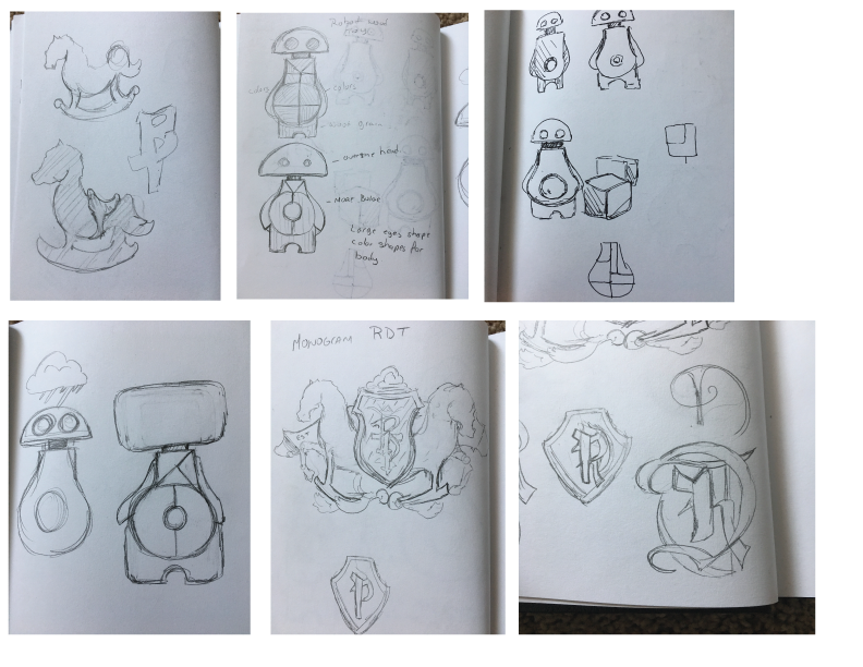
The initial phase was the sketching of the new ideas, although started with the wooden rocking horse idea, the shift started to go toward robots, wood block, and monograms.
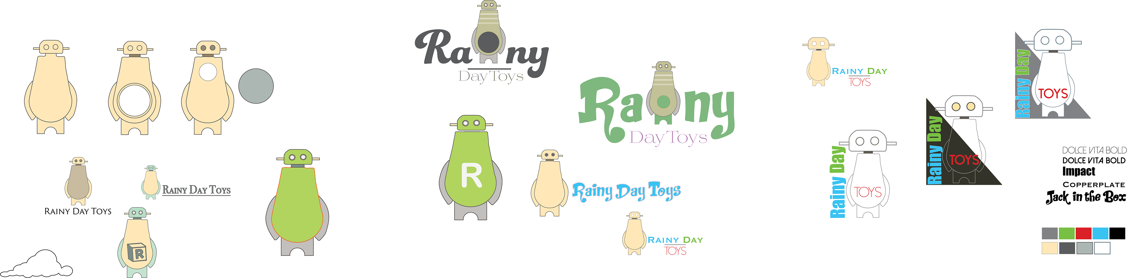
The exploration of the robot idea, from the simple one color idea to different combinations of size, colors, and word with shapes. The goal is to have the logo work well against light and dark background even when other colors are present.
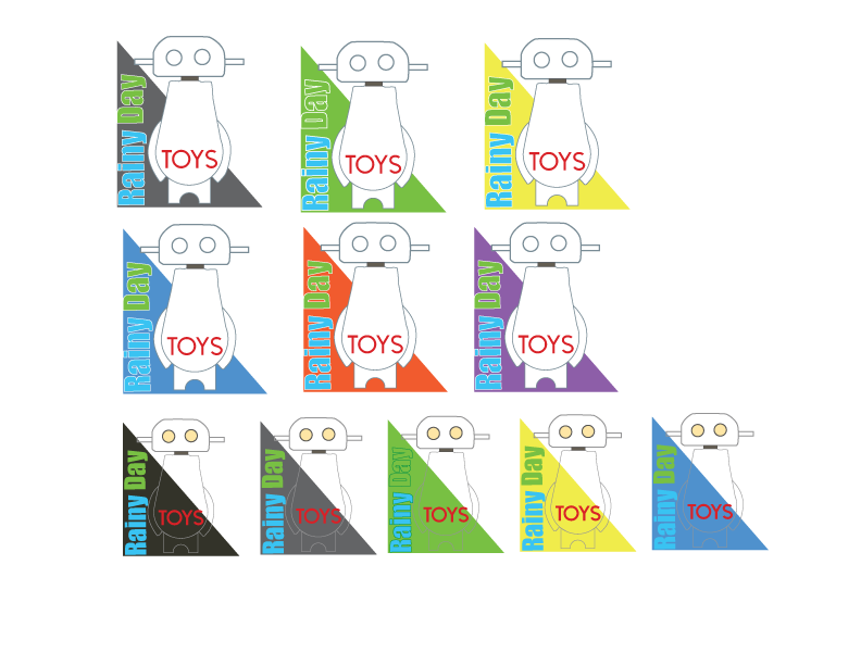
Variation of colors for the logo with bright and darker colors. The combination can be seen successful when it's the background shape that it's the main color change and not the design of the robot.
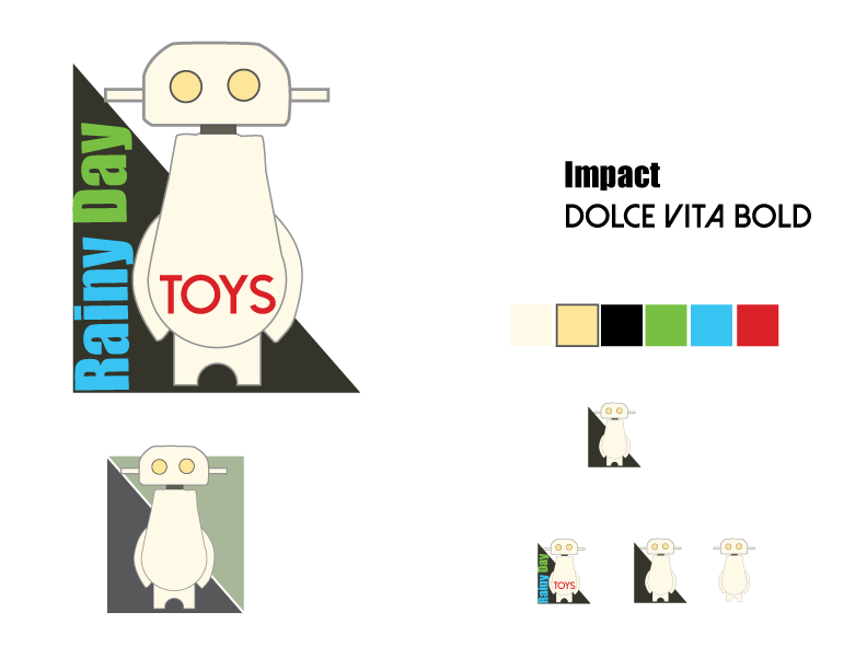
After a quick breakdown of the idea behind the design what works is the shape that, even though the option to change to different colors is there, the logo can be used as is while utilizing the negative space to be used on different colors and still keeping the 3 main colors without affecting them. The size adjustment in order to see which looks better when in use for different media.
The first version of the logo as motion graphic. Here the text stands alone just the use of color and rain effects are used.
The second version is the use of text and logo as part of the whole brand idea. The idea was good but taking a look again there are too many elements going on at once and it starts to take away from the brand and becomes somewhat confusing.
Here the logo is simply standing alone with just the robot forming out of the wood pieces.
After some more research what looked better was just making the logo as simple as possible by just making all the elements just form a single unit. The result looks like a very playful fun design.
The revision here is a version of the robot but more animated, so looks more like a child animation.
Revision of Logo for Rainy Day Toys
While the first part of the design took the direction of the robot for the wooden toy company, on the next part the idea was to be pushed beyond just simple design with color and just bring it a more sophisticated look to appeal the targeted audience.
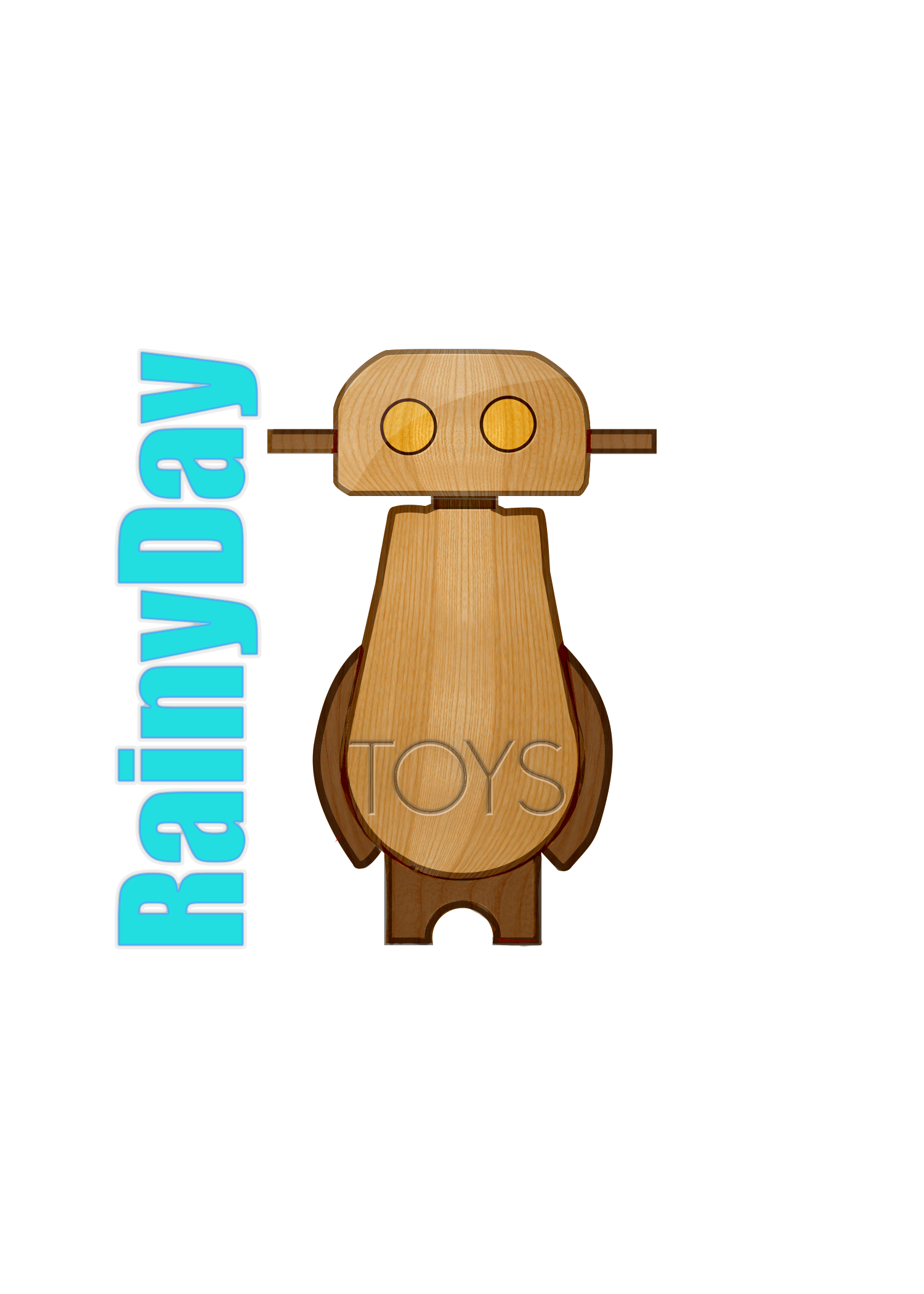
The first one took the robot and apply a texture to it, got rid of the triangle and made the Rainy Day text one color while making it appear as the word toys are carved on the robot.
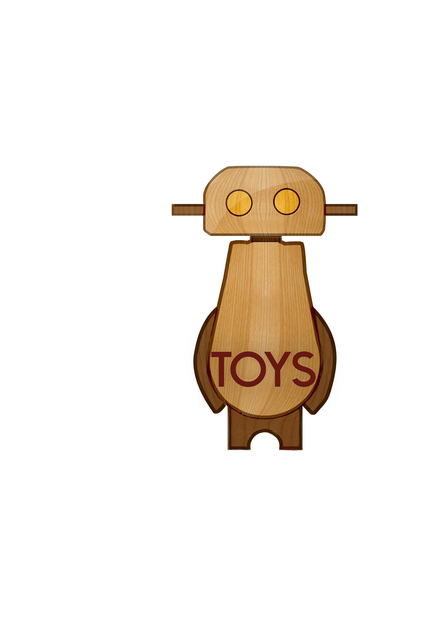
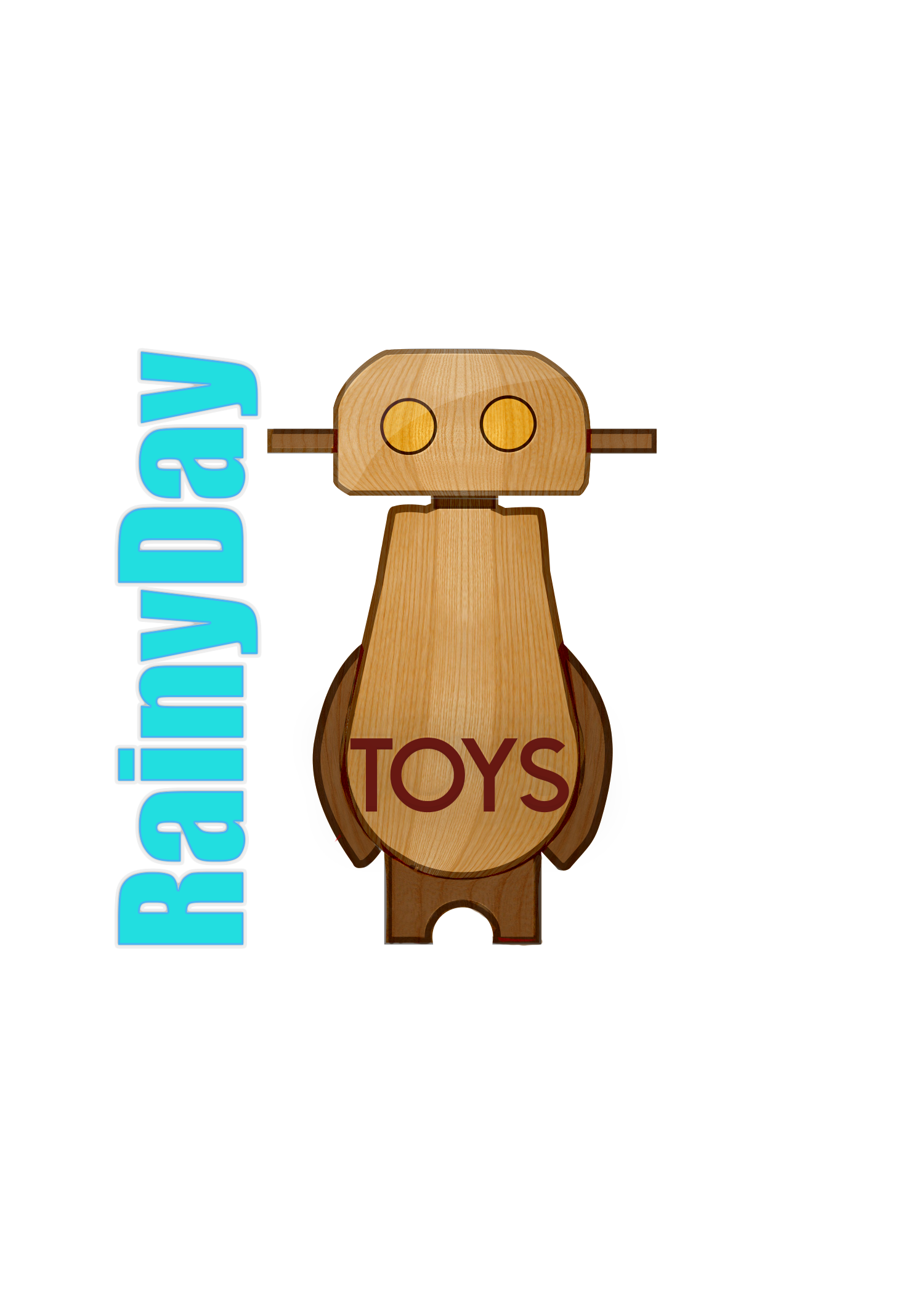
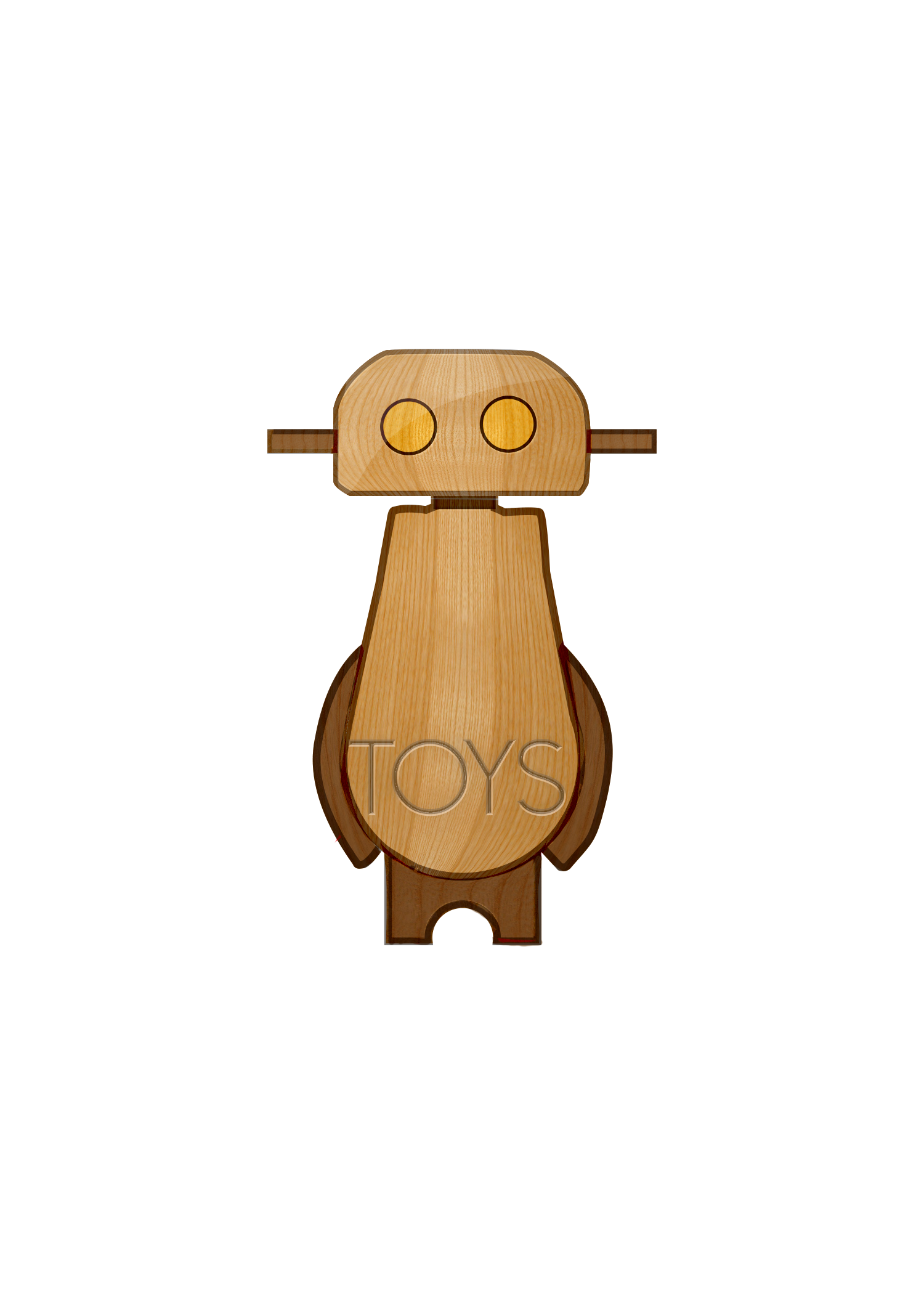
The second revision for the logo just tweaks the word "toys" and chose to make it bolder so visually it can be easily seen even when the logo is scaled down.
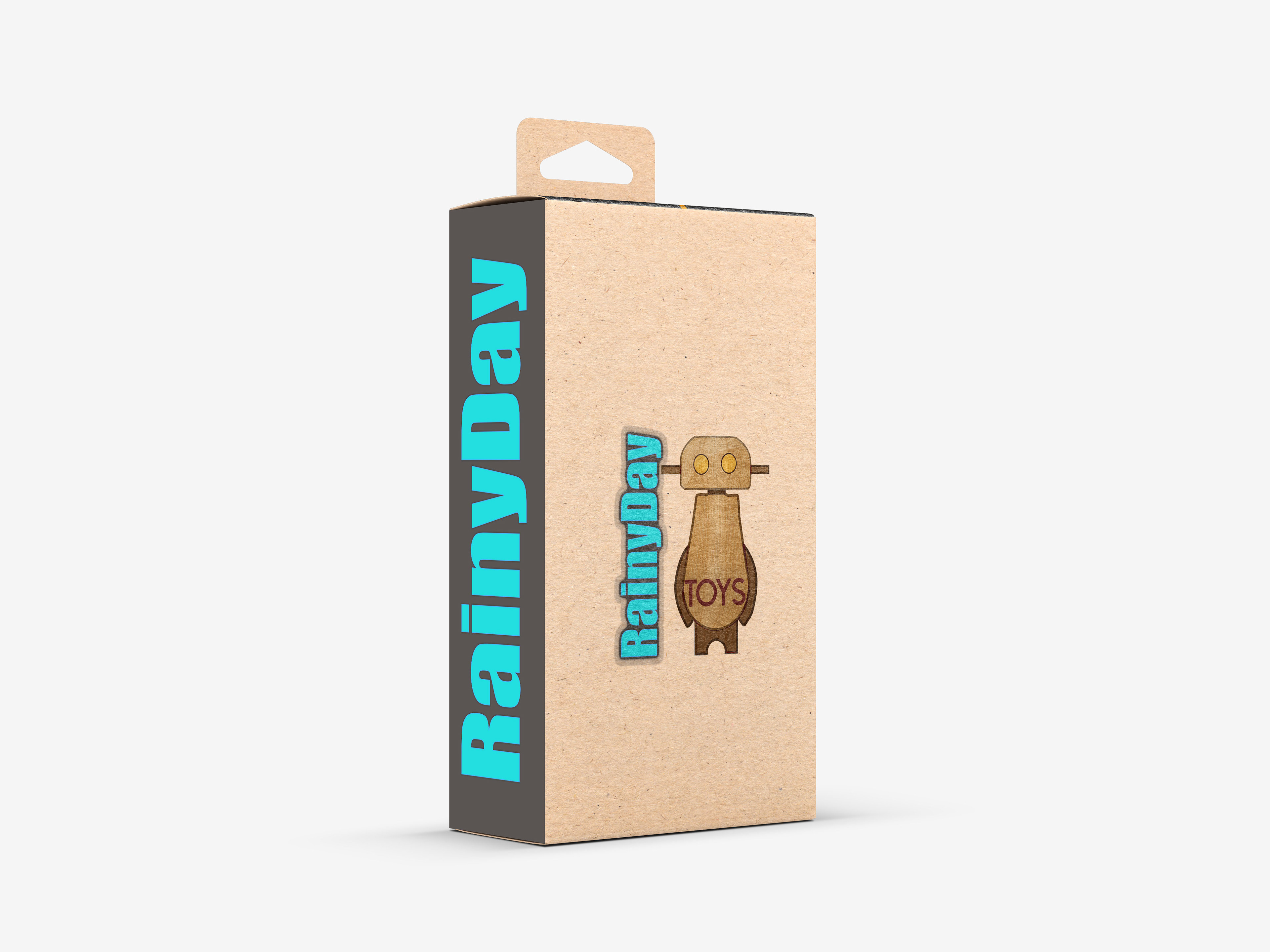
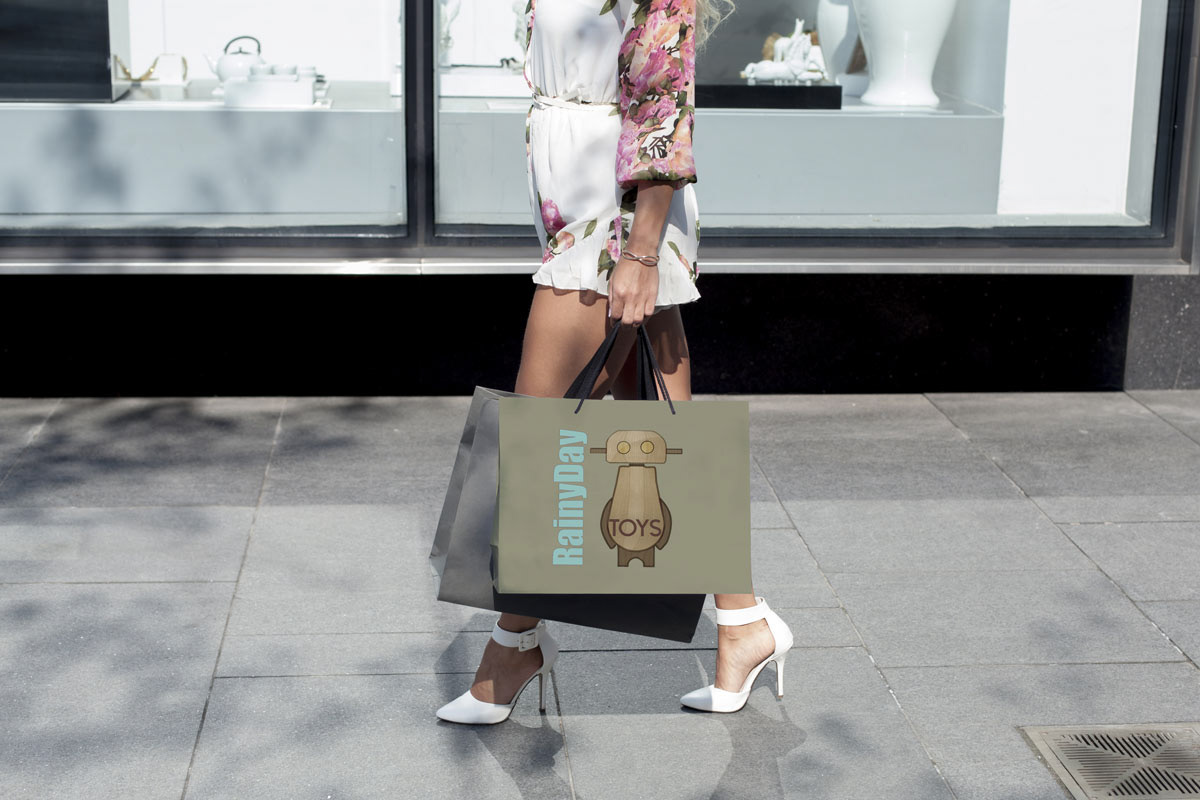
The mockups are for what the wooden toys box would look like when it arrives, and the shopping bag the store would be using.
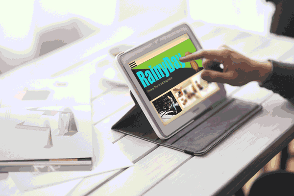
Working on the new logo also meant revising the website mockup also and showing it alongside what it would look like on a mobile device.
The first animation shows the logo with a red texture for that nostalgic red wooden toys. The change included also the pink eyes.
The second revision to the animation changed the color of the rain and the eyes started to be more of a blue and less pink. The words Rainy Day also was added with its own animation that would change phases of color before ending on blue.
This motion graphics changed the color of the robot to a simple two-tone wood color and added a little more emphasis on the eyes. The words Toys can be seen here as a woodcut and less of paint.
::
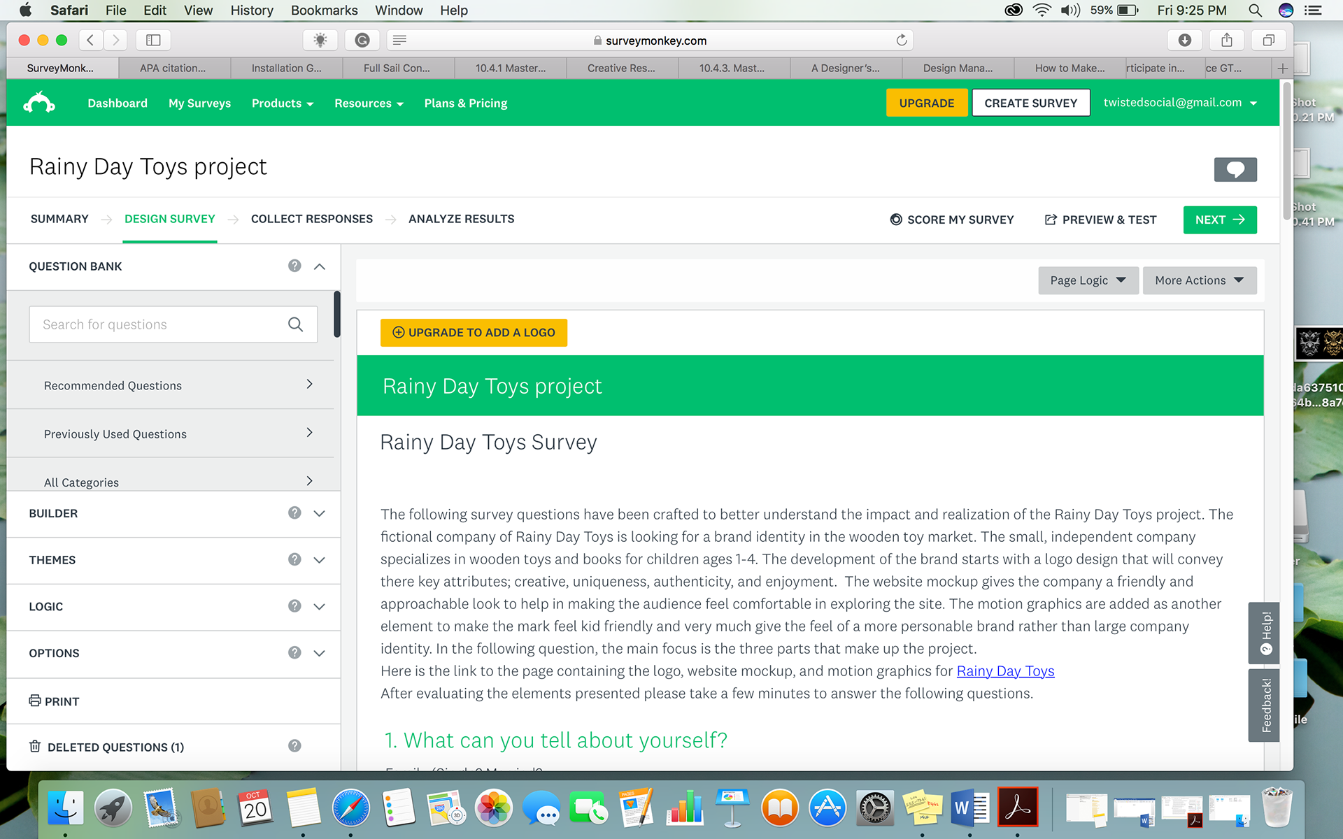
The Survey
As part of the Rainy Day Toy project, a survey was sent out the targeted audience in order to get feedback on how well the design worked with the company’s brand. The questions ranged from how well the logo worked for the brand, to color pallet used to inspire certain emotions, and how incorporated was the design in showing it in different media.
The survey was sent out with a brief introduction to the project and question that pertain to shopping hobbits. Understanding how the target audience shop helps in further tweaking the brand to have more focus specific areas such smartphone or mobile devices.
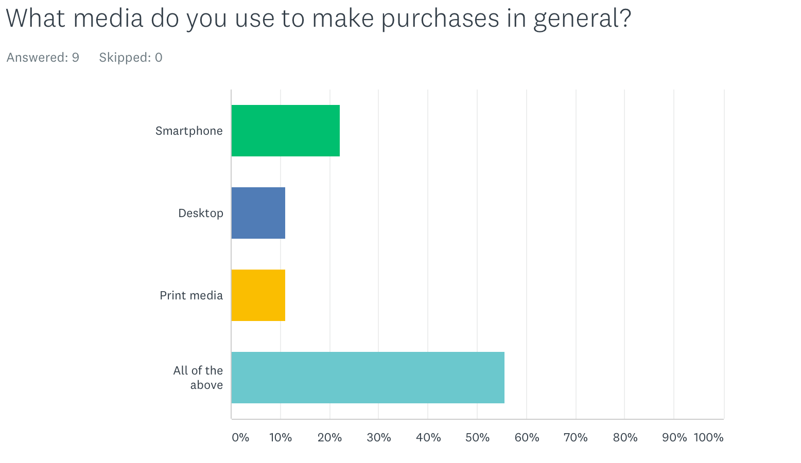
Above it shows the percentage amount that uses mobile to print and desktop and for those who have no preference. That translates into being able to show the brand in multimedia form with little restrictions.
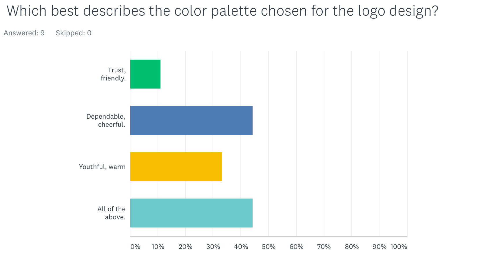
Color is important, especially when gearing a brand to be kid friendly and also when building trust and loyalty with the audience.
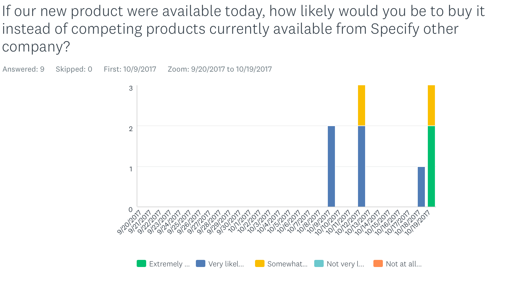
Another relevant question was about how likely would the audience be to actually go and make purchases based on the brand identity provided. Although these where just a few of the questions that it was asked in the survey they all provided some insight on how well the logo worked when implemented. Having the audience willing to shop for products from Rainy Day Toys would be considered a successful design.
Thank you