
The posters for Romeo and Juliet that are represented here are an exercise in being able to recreate the work using Adobe InDesign. Each representation showed a different way of assembling the elements necessary in order to create the poster. All of the work shows hierarchy in the text placement and how it can be used to create different effects when its arranged in a certain way. The focus is mainly typography and less about other elements that inspire the design process.
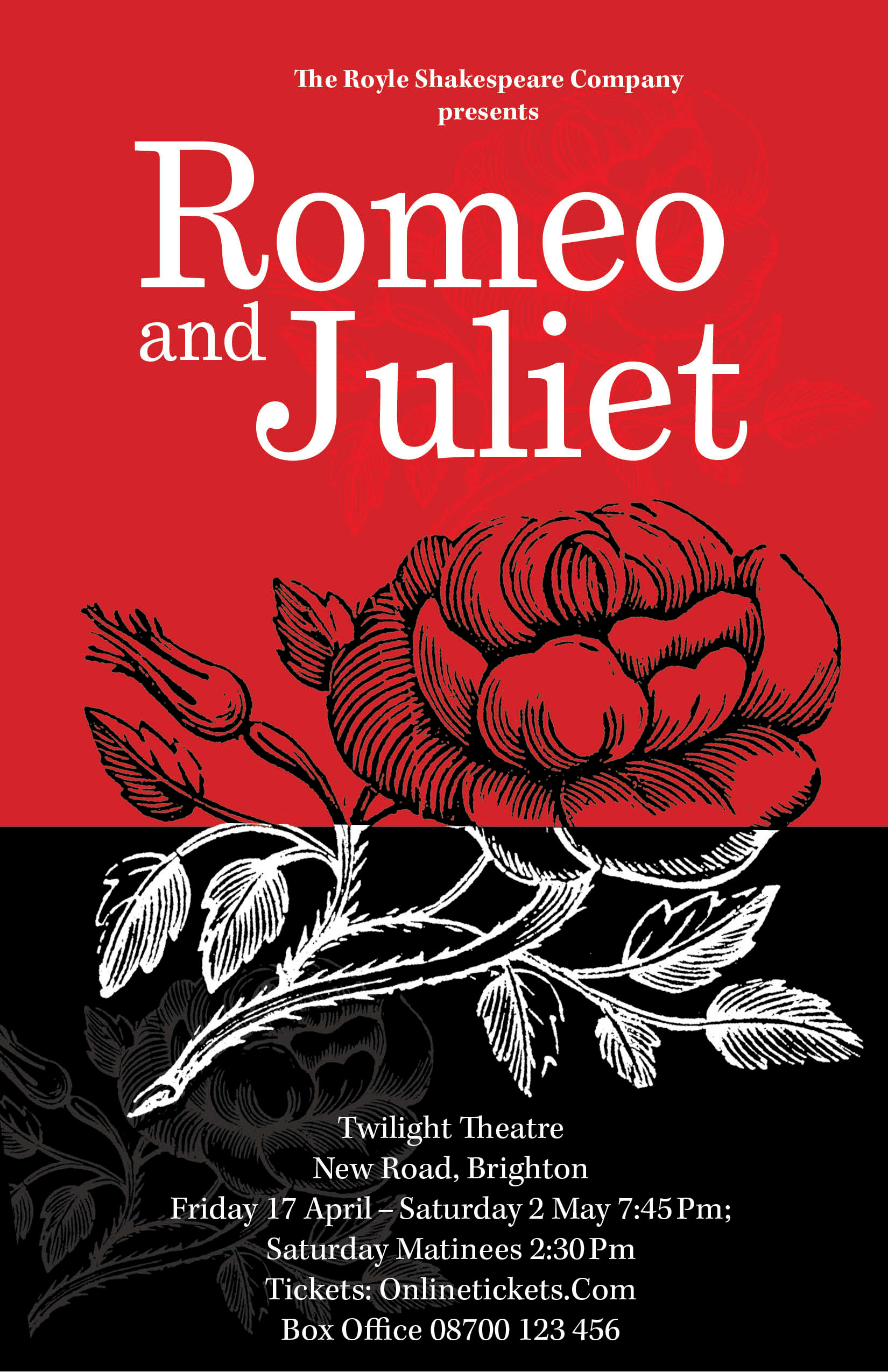
WoodCut rose, use the wood cut image more as to create a pattern that doesn't take the focus away from the typography
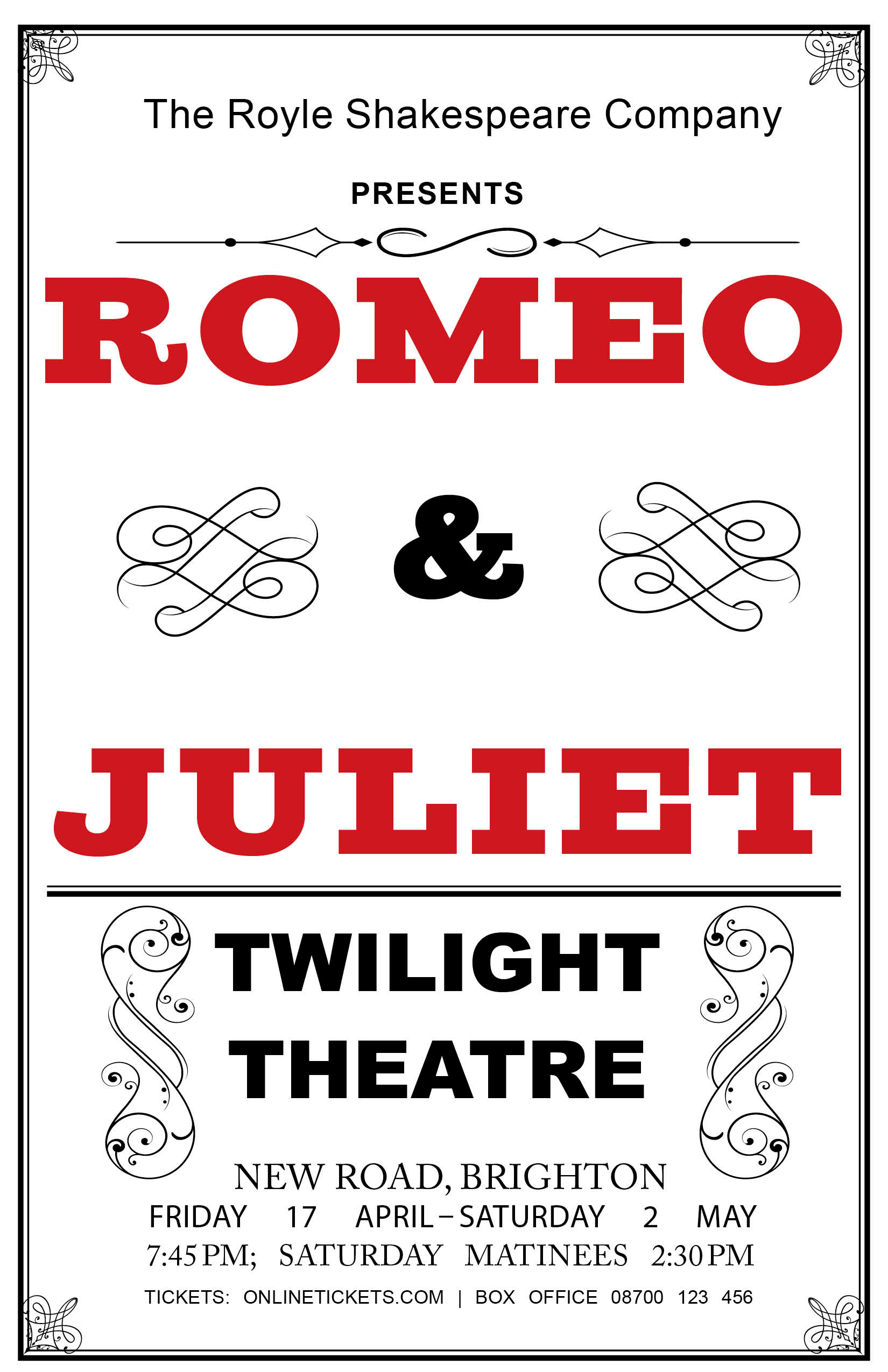
Vintage poster, using small embellishes to frame the typography that is displayed in a very strong, bold manner
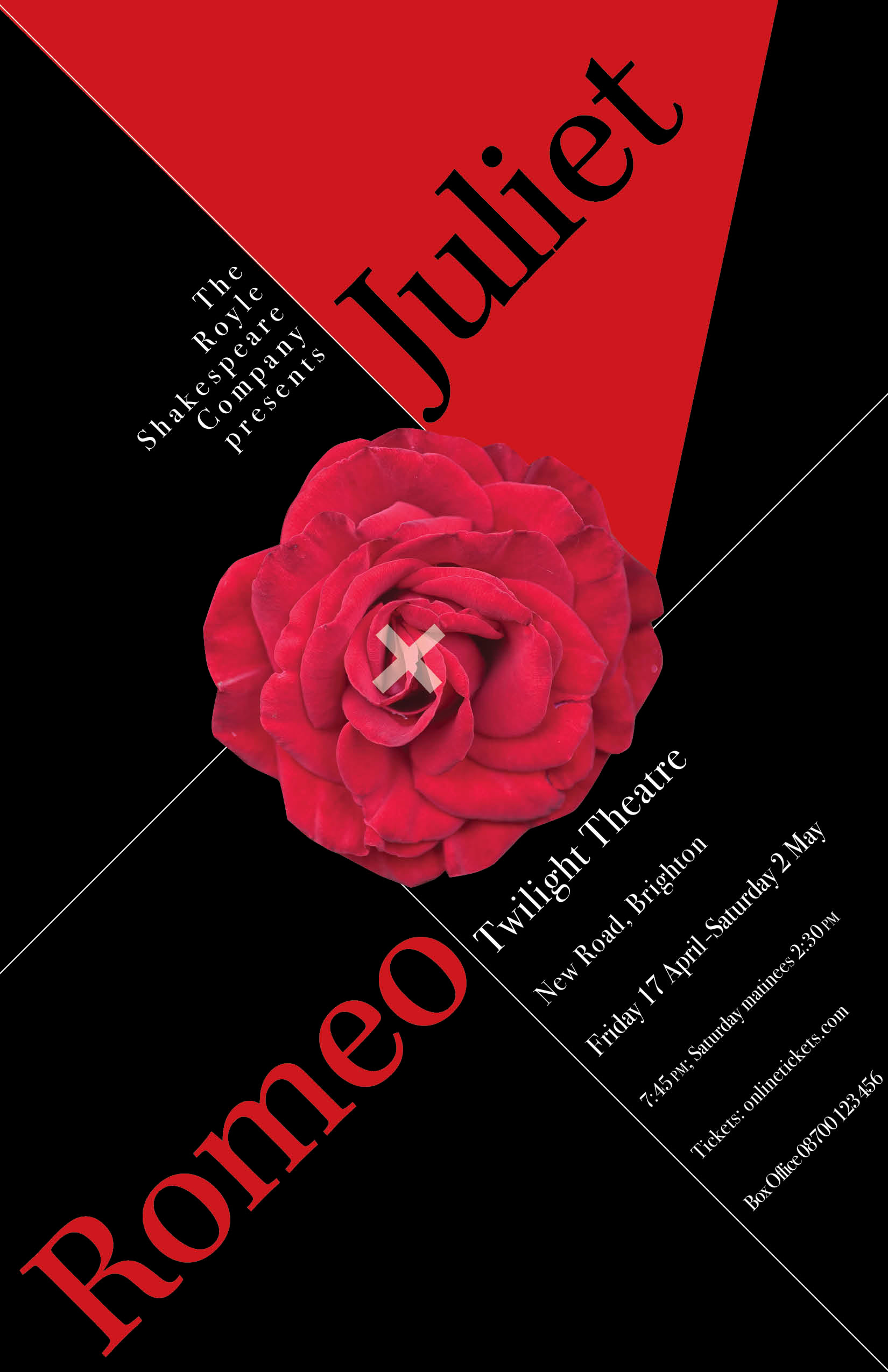
Modern rose, uses real images and color to emphasize the play, the hierarchy is divide yet still shows clear